Animelon Homepage Redesign - Applying Cognitive & Gestalt Principles
OVERVIEW
Optimizing key sections for a clearer, more usable experience.
This project was part of a weekly UX challenge where I redesigned selected areas of Animelon’s homepage using cognitive and Gestalt principles.
The goal wasn’t to reinvent the brand, but to improve clarity, reduce cognitive load, and modernize outdated interface elements while staying true to Animelon’s identity.
Throughout this redesign, I applied laws such as Fitts, Hick, Miller, Aesthetic-Usability, Doherty Threshold, and several Gestalt principles (Proximity, Similarity, Continuity, Common Region) to create a cleaner, more intuitive experience.
Goals & contraints
Clarifying the goals and the boundaries set for this UX exercice
This redesign was intentionally limited in scope. The objective wasn’t to rebuild Animelon from scratch, but to identify key usability issues on the homepage and improve them using established UX laws.
The exercise focused on five micro-interfaces, each selected because they exhibited cognitive overload, outdated design patterns, or weak hierarchy.
Additionally, I worked under several constraints to stay aligned with the original platform:
GOALS
- Improve visual clarity and hierarchy across the homepage
Reduce cognitive load using Gestalt & cognitive principles
Modernize UI elements while keeping Animelon’s identity recognizable
Create interaction patterns that encourage easier exploration of the platform
Ensure desktop-only improvements (no responsive/mobile redesign)
CONSTRAINTS
- Keep the original brand colors or stay very close to them
No changes to site structure, navigation depth, or content strategy
Redesign strictly limited to:
Hero section
Top navigation bar
Donation section
Anime catalog section (cards + filters)
Updates / Blog section
No backend, no new features — only UI/UX improvements
“Before / After” must remain easy to compare
RESEARCH & DIAGNOSIS
Understanding The Interface Issues
A close analysis of Animelon’s homepage revealed several usability and visual design problems affecting navigation, clarity, and accessibility.
Each micro-interface has been captured in an annotated screenshot, highlighting the main issues.
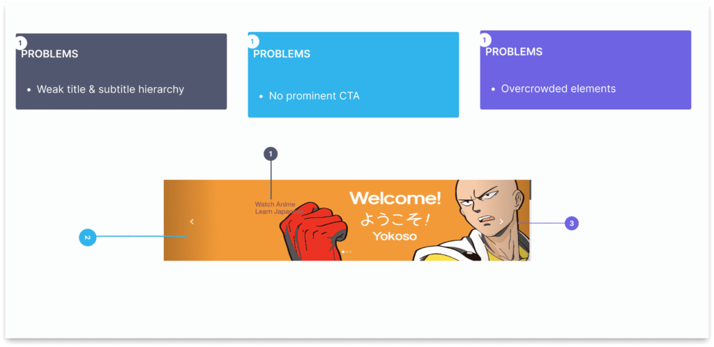
1. Hero Section
The hero lacked hierarchy and clear messaging. Users struggled to understand the platform at first glance.
Problems Identified:
Weak title and subtitle hierarchy
Overcrowded elements
No prominent call-to-action button
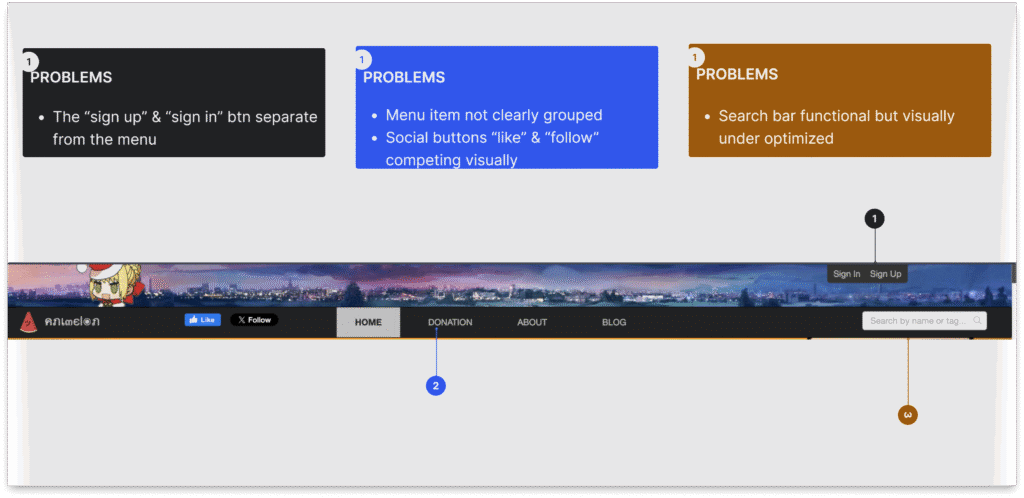
2. Top Navigation Bar
The top bar was cluttered with misaligned buttons and poorly grouped menu items.
Problems Identified:
Login and Sign Up separated from the menu
Social buttons (Like, Follow) competing visually
Search bar functional but visually under-optimized
Menu items not clearly grouped
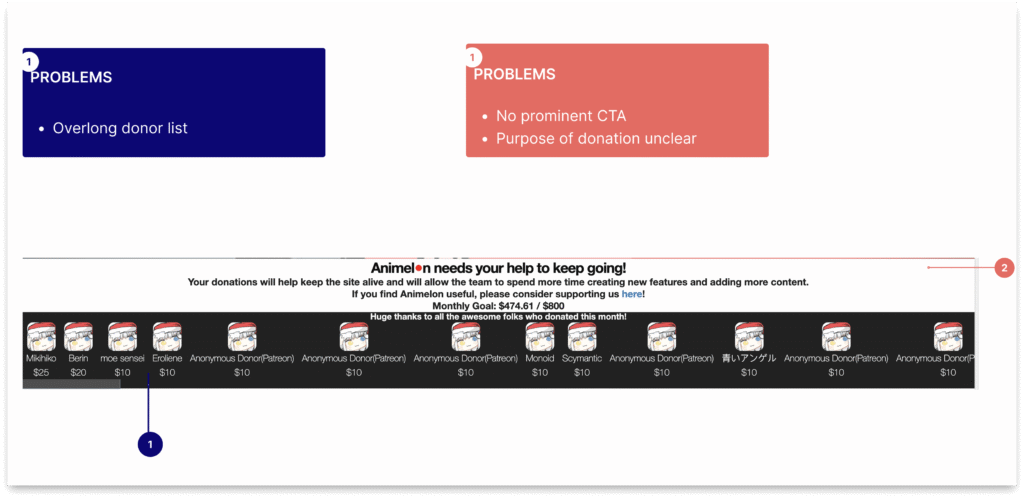
3. Donation Section
The donation area mixed messaging, donor avatars, and links, creating visual overload.
Problems Identified:
Overlong donor list, hard to scan
Purpose of donation unclear
CTA not obvious
Avatars provided no context (name/amount)
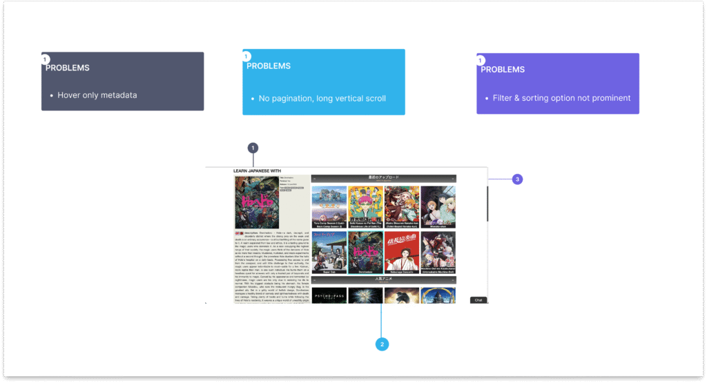
4. Anime Catalog
The anime cards were inconsistent, information hidden on hover, and the catalog lacked clear navigation.
Problems Identified:
Hover-only metadata, inaccessible for quick scanning
Long vertical scroll, no pagination
Inconsistent card layout
Filter and sorting options not prominent
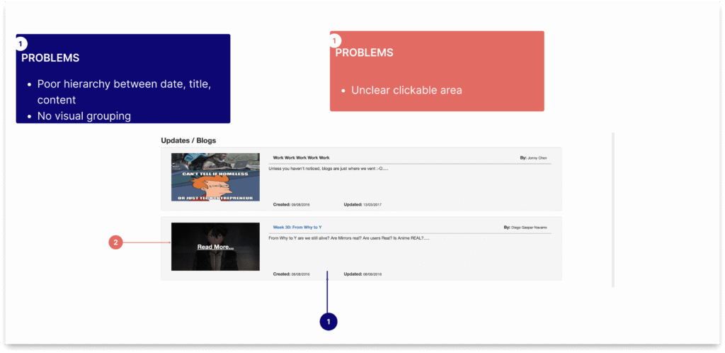
5. Updates/ Blog Section
The updates/blog section was dense and lacked clear hierarchy, making content hard to scan.
Problems Identified:
Poor hierarchy between title, date, and content
Unclear clickable areas
Dense vertical stacking, insufficient white space
No visual grouping
ux laws applied
A Clear and Intentional Use of Cognitive and Gestalt principles.
In this project, every improvement was guided by specific UX laws to reduce cognitive load, enhance clarity, and create a more intuitive browsing experience. Below is an overview of the key principles applied throughout the five redesigned micro-interfaces.
1. Gestalt Principles
Applied to: Navigation bar, hero section, donor section, anime catalog
How it helped:
Grouping related elements together improved scannability (proximity).
Consistent visual treatments supported recognition (similarity).
Clear hierarchy guided the user’s attention effortlessly.
2. Hick's Law
Applied to: Donor section, catalog filters
How it helped:
Reducing the number of visible choices made decisions faster.
“See All”, paginated catalog, and simplified donor list reduced overwhelm.
3. Miller's Law
Applied to: Donor carousel, anime card information
How it helped:
Limited visible donor entries to 5–7 to avoid overload.
Condensed anime metadata into meaningful, digestible chunks.
4. Fitts's Law
Applied to: CTAs, navigation buttons, watch buttons, pagination
How it helped:
Larger, clearer targets improved clickability.
Buttons were repositioned and spaced to reduce movement effort.
5. Aesthetic-Usability Effect
Applied to: Hero section, cards, donor section, blog updates
How it helped:
Cleaner visuals increased perceived credibility.
More polished, modern UI created trust and smoother engagement.
6. Doherty Threshold
Applied to: Search bar with instant suggestions
How it helped:
Feedback under 400ms keeps the user mentally engaged.
Search suggestions improve flow and reduce friction.
Visual Improvements Gallery
A Clear Look at What Was Changed and Why.
This gallery highlights the main UX issues found in each micro-interface and the improvements introduced through layout restructuring, clearer hierarchy, and targeted UX principles. Each pair is annotated to help readers quickly understand what was wrong — and how the redesign solves it.
1. Header & Hero Section
A cleaner structure, clearer hierarchy, and simpler interactions.

After → Streamlined nav with better proximity, simplified actions, and improved visibility; Strong headline, clear supporting text, high-visibility CTAs.
2. Donation Section
A more meaningful, gratitude-focused layout.
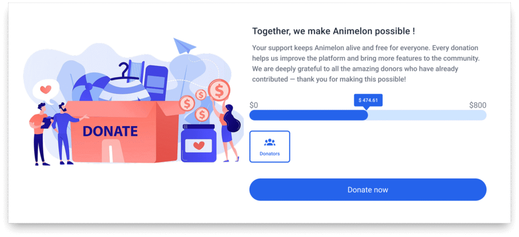
After → Structured two-part section: purpose, donors list inside a button + illustration
4. Anime Catalog
Cleaner cards, structured metadata, and smoother browsing.
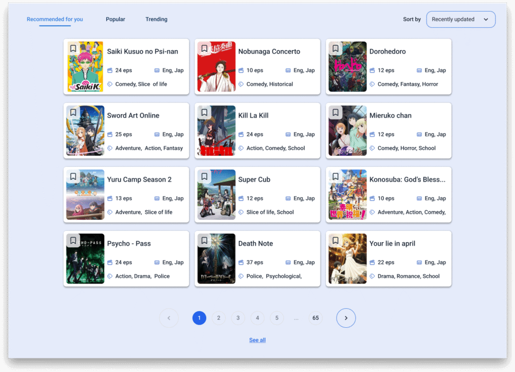
After → Three column cards, clean metadata, hover state revealing a focused action.
5. Blog Section
Improving clarity, recency visibility, and content scanning.
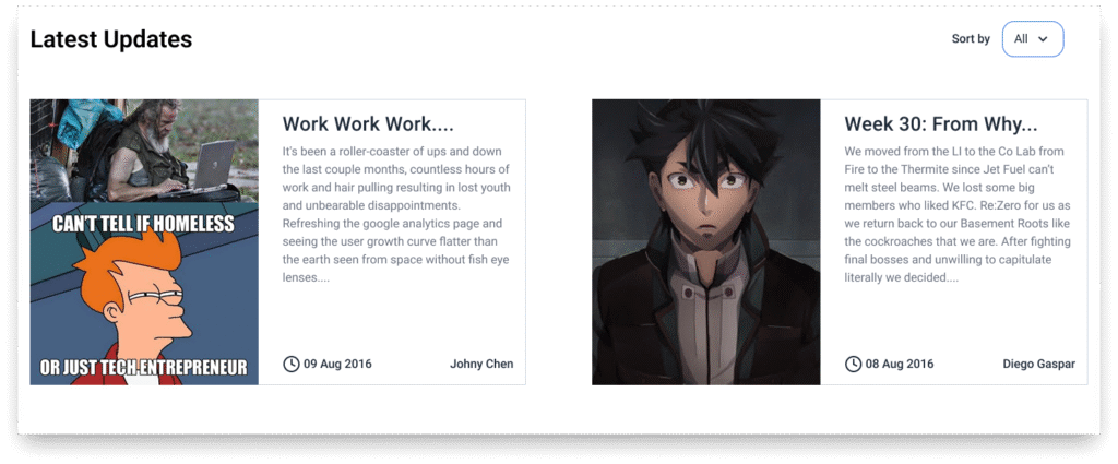
After → Cleaner layout with improved hierarchy and better preview details.
Conclusion
Wrapping Up
This focused UX exercise allowed me to explore how cognitive and Gestalt principles can meaningfully improve clarity, hierarchy, and usability within a real interface. By redesigning key sections of Animelon’s homepage, I transformed a visually crowded layout into a cleaner, more structured experience that better supports discovery, navigation, and user engagement.
From reorganizing content blocks to refining visual hierarchy and interaction patterns, each improvement was intentionally designed to reduce cognitive load and guide the user more naturally. The result is a more modern, accessible, and welcoming interface that stays true to the spirit of the platform while elevating the overall experience.
Curious to explore the full interface ?