Happy Hours - A Helping Hand For Busy Parents
overview
Happy Hours is a mobile solution designed for busy parents who struggle to manage their children’s extracurricular schedules. The goal was to centralize discovery, booking, and communication into one seamless, trustworthy experience.
TIMELINE
04 Weeks - Design Sprint
ROLE
Lead Product Designer (Solo Project)
TOOLS
Figma, FigJam
the challenge
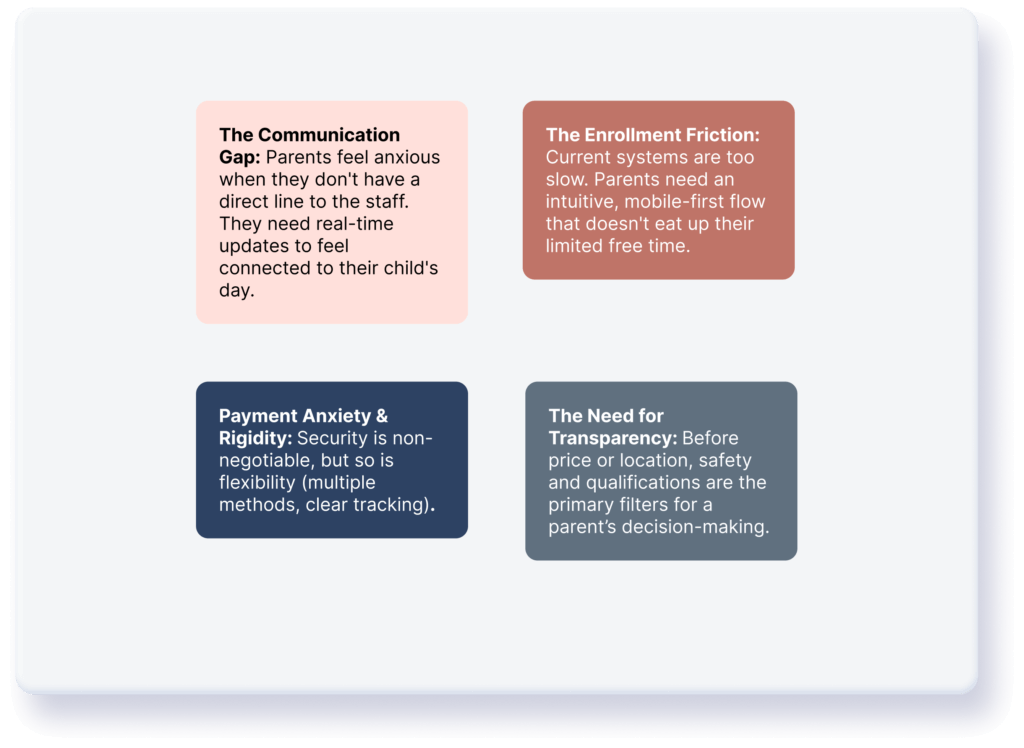
“Managing extracurricular activities is an administrative hurdle that parents didn’t sign up for“
Early research confirmed that for busy parents, the joy of seeing their child learn a new skill is often overshadowed by the complex logistics of enrollment, payment, and staying informed.
Based on my first round of user interviews, I identified 4 core pillars to address.
the goal
The primary objectives of Happy Hours were centered on transforming the administrative burden into a seamless experience. My goal was to centralize communication by creating a direct, reliable bridge between parents and instructors, while simultaneously simplifying the enrollment flow into a few intuitive steps. By establishing a secure foundation through a transparent, multi-option payment gateway, the app ensures that parents can focus on their child’s growth with total peace of mind.
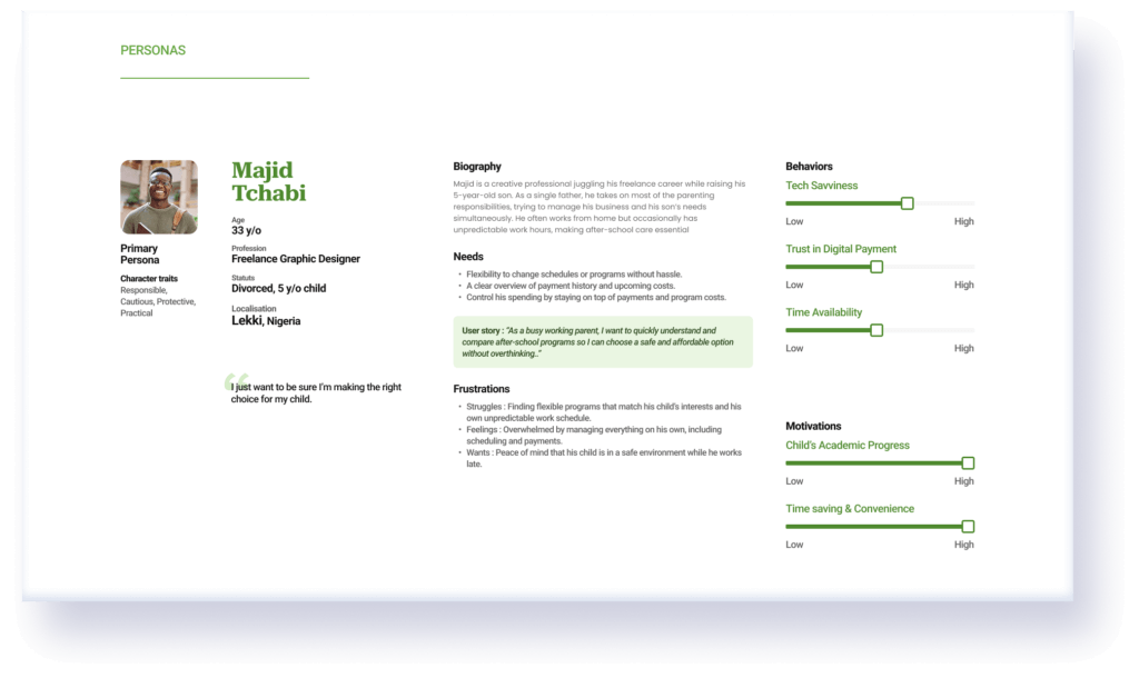
meet the personas
Empathazing With Parents
To design a solution that truly resonates, I synthesized my research into two primary personas. They represent the two ends of the “Busy Parent” spectrum.
Julie, 37 - Full time mom

Majid, 33 - Single father
Ideation & strategy
The "How Might We" Questions
To bridge the gap between user pain points and the interface, I framed my design strategy around three core challenges.
For Organization: How might we provide parents with a clear, real-time overview of their children’s busy schedules?
For Communication: How might we create a direct and reliable link between parents and instructors?
For Efficiency: How might we simplify the search-to-booking journey to fit into a parent’s frantic daily routine?
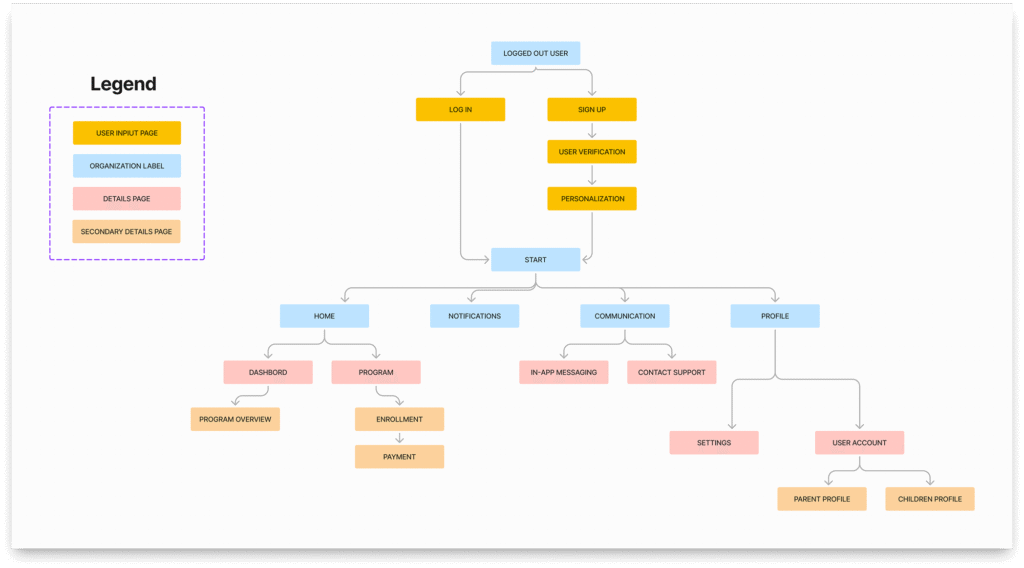
Ideation & strategy
Initial Information Architecture
My goal was to create a lean navigation system where “Action” and “Information” are perfectly balanced. The initial architecture focused on establishing a solid foundation for discovery and management.
Ideation & strategy
The User Journey (The "Happy Path")
I mapped out the ideal journey to ensure a logical flow from the first touchpoint to the final confirmation.

the solution
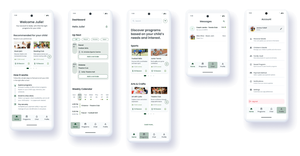
A Closer Look At Our Key Features
To address the specific needs of parents like Sarah and David, I designed an interface that prioritizes clarity, speed, and peace of mind. These core features form the backbone of the initial Happy Hours experience.
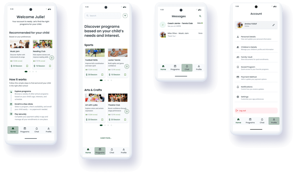
Personalized Discovery Home
A personalized recommendations, smart filters, alongside a dedicated 'How it Works' section.
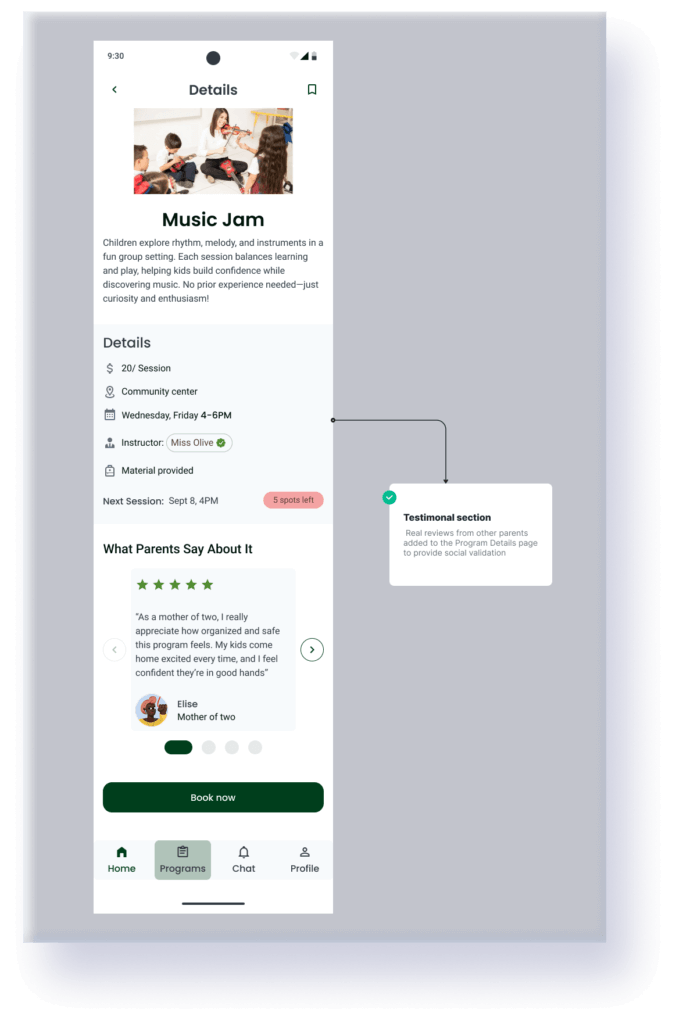
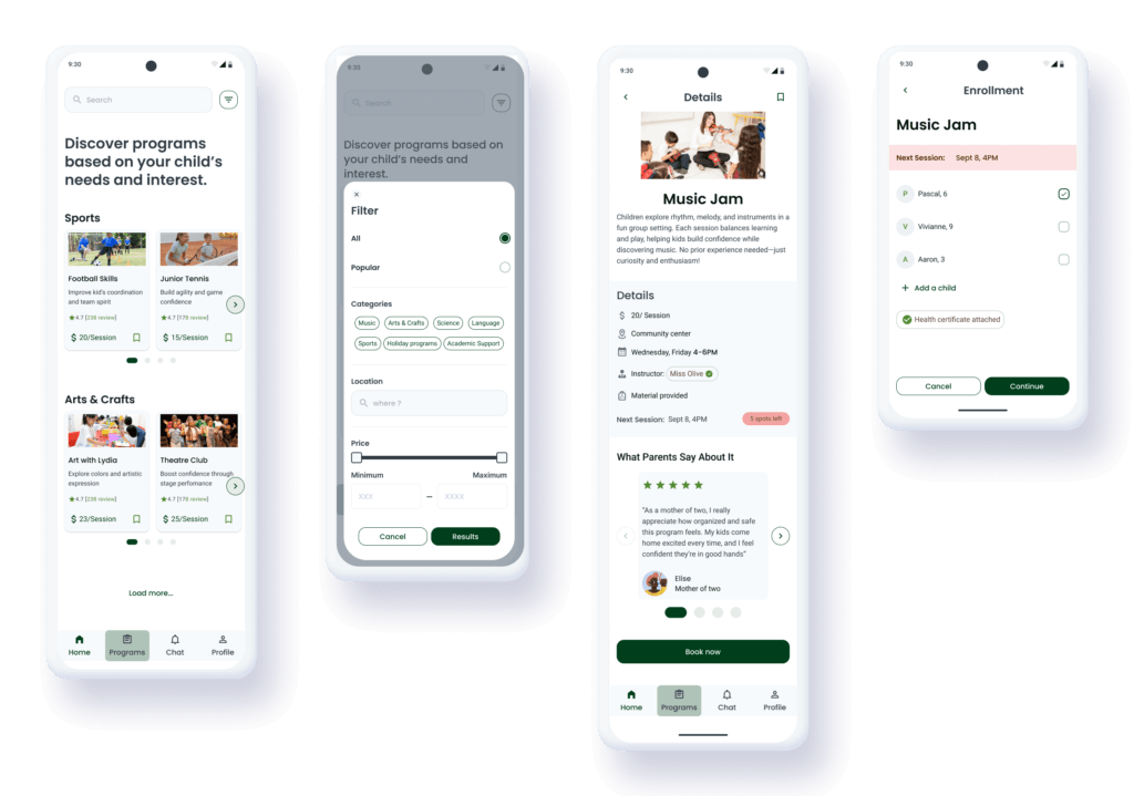
Transparent Program Details
Verification badges for instructor, and visual data architecture to bridge the "Trust Gap".
Integrated Chat
A dedicated messaging hub that provides a secure, direct link between parents and staff.
The Family dashboard
The "Command Center" designed for daily management and logistical ease with an "Up Next" section and a Calendar strip.
Iterative design
Usability Testing
After completing the initial prototype, I conducted Usability Testing with five parents to validate the flow. While the feedback on the overall UI was positive, the sessions revealed critical friction points that I had to address….
-
Trust Issues
Parents liked the instructor profiles, but they wanted to hear from other parents before committing.
-
Administrative Fatigue
Users were frustrated by having to re-enter information or find documents during the checkout process.
The Refinements
Building social proofs
To fully reassure parents like Majid, I introduced a testimonials section: real reviews from other parents added to the Program Details page to provide social validation.
The document vault
I realized that paperwork was a major “pain point.” I designed a centralized Family Vault within the Profile section.
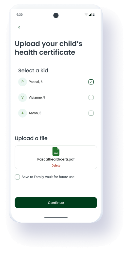
The Solution: Parents can upload medical certificates or ID cards once
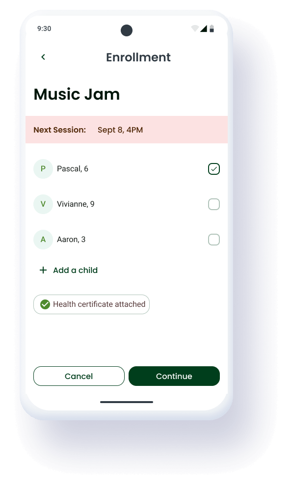
The Impact: These documents are now automatically attached to future enrollments, removing the need for repetitive uploads.
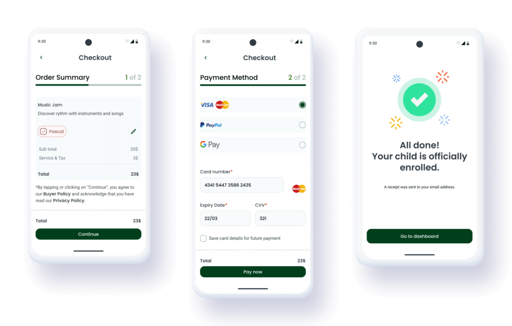
Two-step simplified checkout
I broke down the enrollment process into two distinct, digestible steps to reduce the “drop-off” rate.
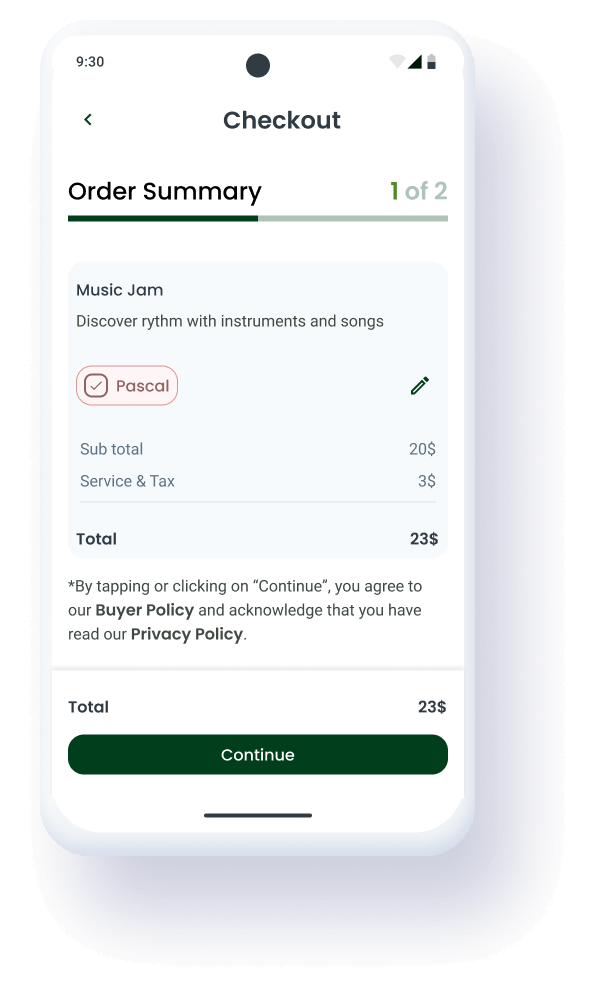
Step 1: Order Summary
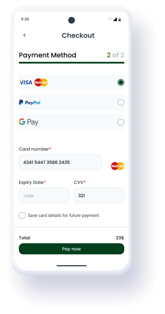
Step 2: Payment
The Result: A much higher sense of security and a 40% perceived increase in speed during testing.
Streamlining confirmation & verification
In the first version, the Success Page offered manual options to “Download Receipt” or “Receive by Email.” Testing showed that this created unnecessary friction and a slight moment of doubt for parents.
-
The Pivot
To ensure a "hands-off" experience for busy parents, the receipt is now instantly sent to the verified email address upon payment.
-
The Result
A cleaner Success Page that focuses on the excitement of the upcoming activity rather than administrative tasks
UI PROCESS
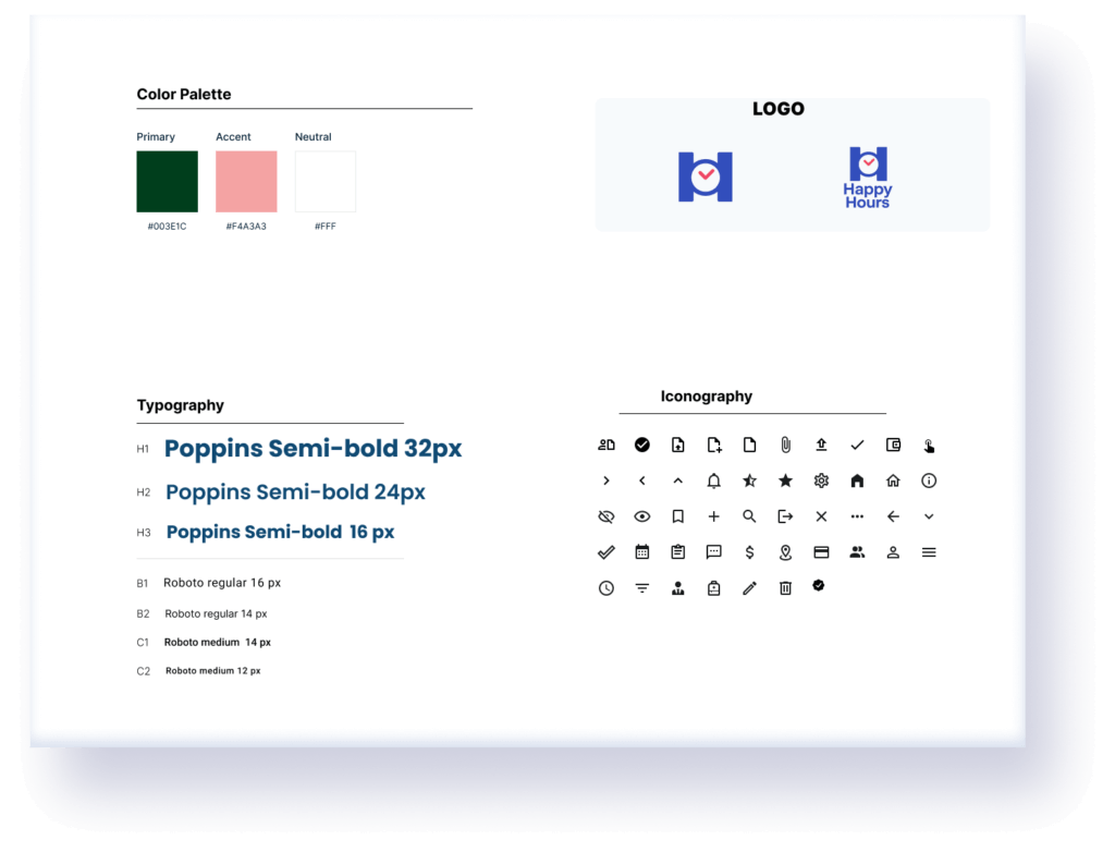
Core Visual Language
To establish a cohesive and trustworthy visual identity, I created a style tile that brings together all the essential foundations of the interface.
The typography scale (1.25) supports hierarchy and readability for busy parents, while the color palette balances safety with the excitement of childhood learning. Finally, the iconography set completes the visual language with simple, recognizable shapes that improve scannability and support fast decision-making.
UI PROCESS
The Building Blocks
To ensure scalability and consistency, I built a modular UI Kit based on an 8pt Grid System
-
Layout & Grid
A consistent grid layout was implemented to maintain alignment across all screens, ensuring a polished, professional look
-
Component Library
Buttons, input, cards and navigation designed with distinct visual hierarchies and states
Final design
Bringing It All Together
The final design brings together all the UX insights, user testing results, and visual foundations into a seamless experience for busy parents. The interface is intentionally structured, and easy to navigate, ensuring that users can enroll their children, explore new programs, and manage payments with confidence.
Each screen reflects the design system’s consistency—from spacing and typography to colors and component behaviors—offering a polished and intuitive product experience.
Homepage & Core Navigation
Program Exploration & Program Details
learning & next steps
Reflection & Growth
This project helped me strengthen my ability to design with clarity and intention, especially when balancing constraints such as accessibility, parent-friendly simplicity, and mobile-first usability. One of the biggest learnings was the importance of user testing at every stage, as each round of feedback significantly improved the experience. I also deepened my mastery of creating scalable design systems that support both consistency and future growth.
Moving forward, I would like to refine the experience with more real-world testing from parents and after-school providers, introduce deeper personalization features, and expand the design system with additional states and responsive layouts. I also plan to explore micro-interactions to make the experience even more delightful.